Read part 1: inspiration and part 2: ideation here.
Testing, Revising, and Iterating
We really valued testing during our process as we wanted to make sure that we got something that didn’t just sound nice in theory but was based on how real humans interact with each other and chatbots. We ran two types of tests; Wizard of Oz testing and Usability testing. The former method was used to test differences between two lo-fi prototype variants while the latter was meant to test our final prototypes.
Wizard of Oz & A/B testing
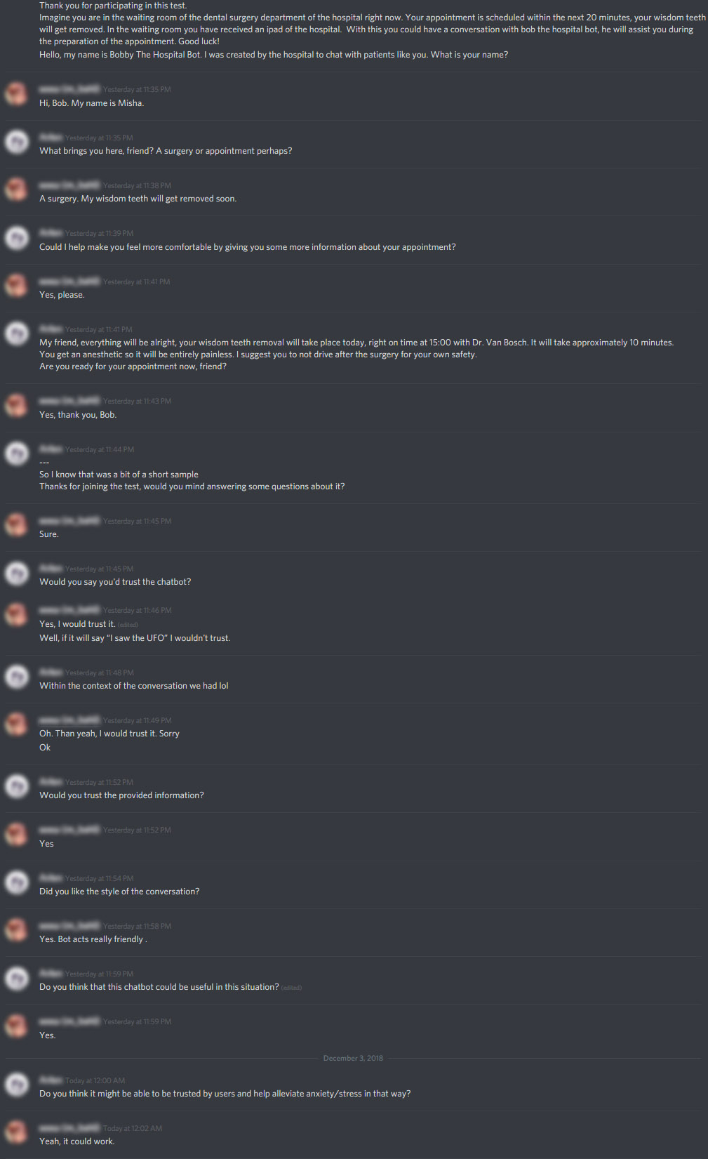
We had two different lo-fi prototype variants worked out at this point in the form as a sort of dialogue script. One focused on a purely competent conversational style, while the other went for a warmer approach. We decided to test these in a textual interface through apps like Whatsapp, Facebook, and Discord. Half our group would test the competent dialogue while the other half would test the warmer one. I tested the warmer variant on some different people from completely different fields of occupation.
Our most valuable insights up to this point were recorded in the document linked below. We used all of these insights to build our final, hi-fi, prototype.
Applied Psychology Interviews Key Insights
Usability Testing
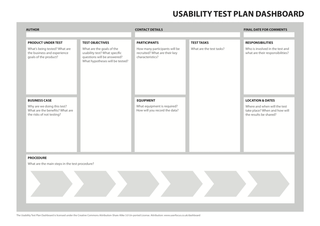
At this point, we had a class about Usability Testing. This came at the perfect time for our hi-fi prototype, as it allowed us to define exactly what we wanted to test, how we should test it and what we’d need the users to do. It gave us a great framework that we iterated on for a while using feedback from presenting it in class a few times and from Wouter directly before we went ahead with the actual tests.
After finalizing the Usability Test Plan, we developed our own usability test. Following the research document we were given at the start of this project, we adapted the questions from a book on trusting robots by Yagoda, R. E., & Gillan, D. J.
We tested the hi-fi concept twice, adjusting to feedback between tests. The final test report can be found here:
Final products:
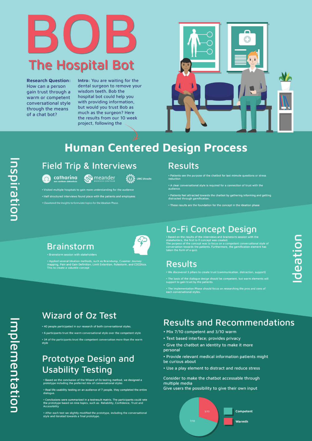
Based on all we learned, Nash, Vince and I worked on putting together an advisory report with all of our most important findings, and an infographic to sum it all up.
Final Reflection:
I learned a lot during this course in terms of the full process, all the steps it takes and what kind of frameworks you can best use to test certain things. I’ve used most of these methods before as an ICT & Media Design student, but not often this structurally. I have always agreed that it is vital to bring in users as soon as possible, however. It is essential that you know who you’re designing things for and don’t simply make assumptions. We’ve brought in users at every step we had something to test and iterated iteration upon iteration with better prototypes each time. And it paid off.
I really like how this project turned out in the end, and I’ve been lucky to have some great teammates to work with. Not only did I learn from our classes, but I also learned from my teammates. Like for example, the way that Vince structured the brainstorming session. Having a plan of attack for the entire project itself is just something that makes it so much easier to get something like this done, and gives time to actually work on the tests instead of constantly having to come up with what to do next as I’ve experienced in previous teams. These are just some of the things I will most definitely take with me to future projects.


