
You can find my prototype document here.
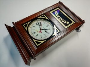
When it came to actually prototyping our protagonists, we were told one of us had to pick the clock we had already bought for our final project. After some discussion within the group, I was the one who picked that part up. It turned out, a week or so later, that we weren’t meant to pick our group objects after all. I was already stuck with prototyping this, however, and had no time to adjust course at that point.
We were sent out to go to thrift stores to look for some objects we could use for our projects. I figured it might be worth looking for other potential clocks. Me, Nash and Rikky went to Het Goed in Eindhoven to see if they had anything we could use but the trip was a bust since they had nothing any of us were looking for. I visited another 3 thrift stores over the next week but most of them didn’t have anything I could use either, or at least nothing better than what I had.
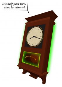
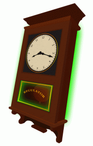
My initial prototype was a 2D representation of the clock we started out with to rapidly test out some ideas with lighting before having to spend money on integrating it. The plan was to make a basic conversation in Dialogflow and integrate it with some of the lighting through means of an Arduino.
This plan turned out to be a little too audacious for the time I had, and thanks to a lack of knowledge of Arduinos and some migraines during that time I missed some classes and didn’t have time to put it all together and the last version of this clock before we started working on the new one only had a phone inside of it with screen blasting colored light through the inside. This sadly wasn’t as bright as I’d hoped, but got the message across to the other students and the teacher alongside the 2D representation.
The feedback from the group brought up some good ideas, such as rotating the hands of the clock when talking. Perhaps even moving them separately to make it look like the clock really doesn’t know what it’s doing and is truly confused. Some suggested rotating colors when it’s confused as opposed to reserving certain colors for just one emotion while others suggested sticking to one color. The overall consensus was that green (like I had already used) or yellow would best fit a confused emotion, while blue radiates certainty and red gives off an angry or authoritative vibe. Some other feedback related to the dialog part, where it was suggested to have the clock ask the user about the time instead of giving the answer when asked.
As a group, we ended up dropping the RGB Leds idea for the clock, and as such I didn’t put any more effort into prototyping that side. However, the feedback of making the hands move was something I worked on for the final iteration of the clock, along with Nash and later our teacher Wouter, too:
Not knowing what the time is is also one of the ideas that lived on in some form into the idle state of our final clock iteration:
Looking back, I probably tried too much to aim for a final product kind of thing where I should have gone for a more lo-fi prototype to test out the features, concepts and such first. “Fail fast, fail often” doesn’t quite solve what I did wrong during this process but it is something I will keep in mind for rapid prototyping in the future.